Mobility Patterns of Low-Income People Lead to High Exposure to Respiratory Hazards

Introduction
This research investigates the relationship between PM2.5 emissions and economic groups in Harris county, Texas. The results of the study found that low-income groups are more likely to be exposed to PM2.5 harmful substances. Detailed research report can refer to the link. This article is dedicated to presenting the advanced drawing methods and drawing results used in the research.
Language
SQL: Querying data from the database
Python: Data processing and Data visualization
- Matplotlib
- Seaborn
- Geopandas
Data Visualization
1. Map and Scatter plot with density
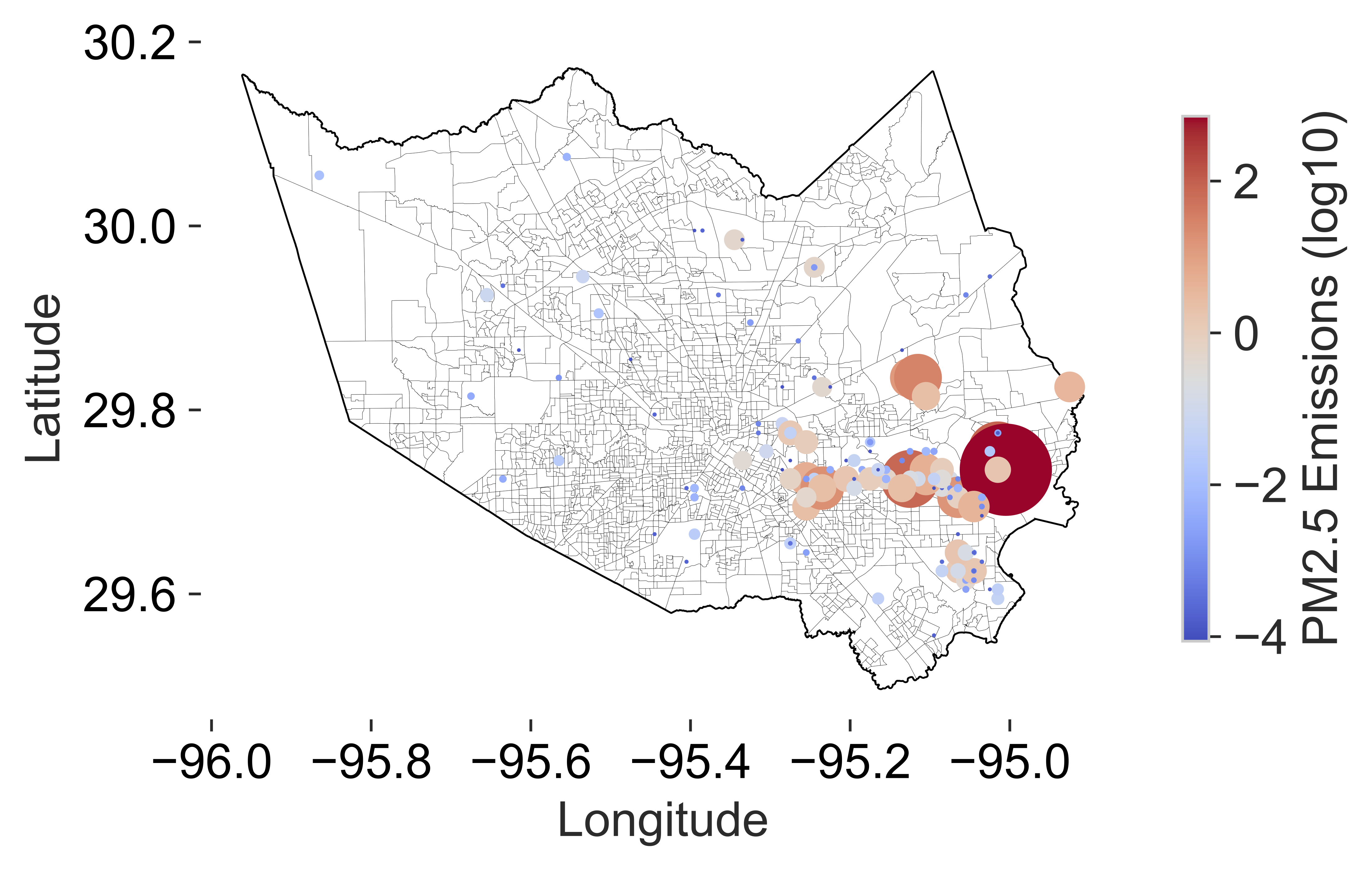 This graph presents a density map of PM2.5 emissions in Harris County, Texas. If the amount of discharge is larger, it is represented by a larger circle; if the amount of discharge is small, it is represented by a small blue circle. Both the shade of color and the size of the circle are related to emissions.
Code
2. Handmade grid map with density
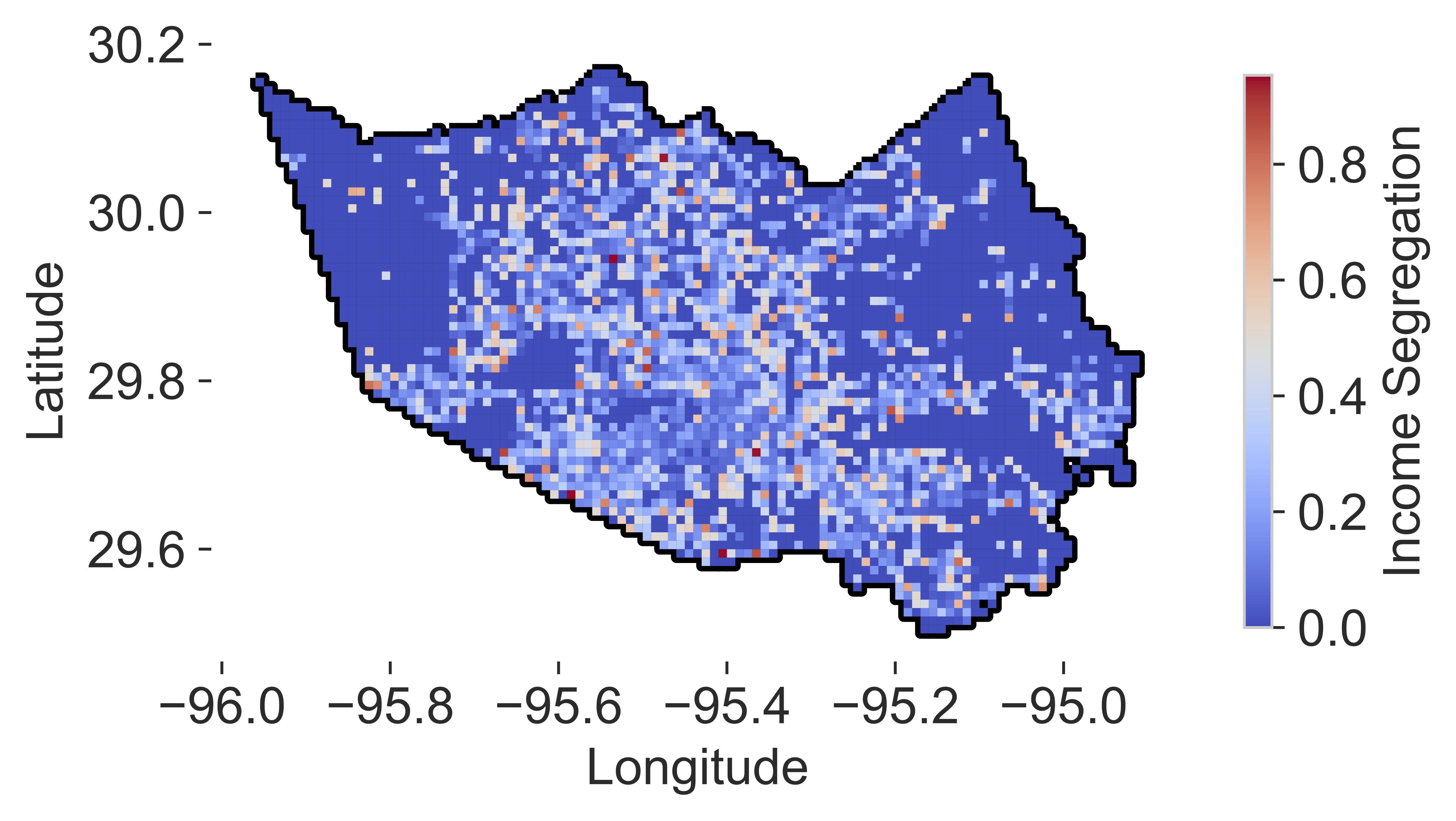 This picture uses the latitude and longitude cutting method to cut the longitude and latitude of Harris County. And calculate the household Income of the square for Segregation transformation, and visualize it as shown above.
Code
3. CBGs based map with density
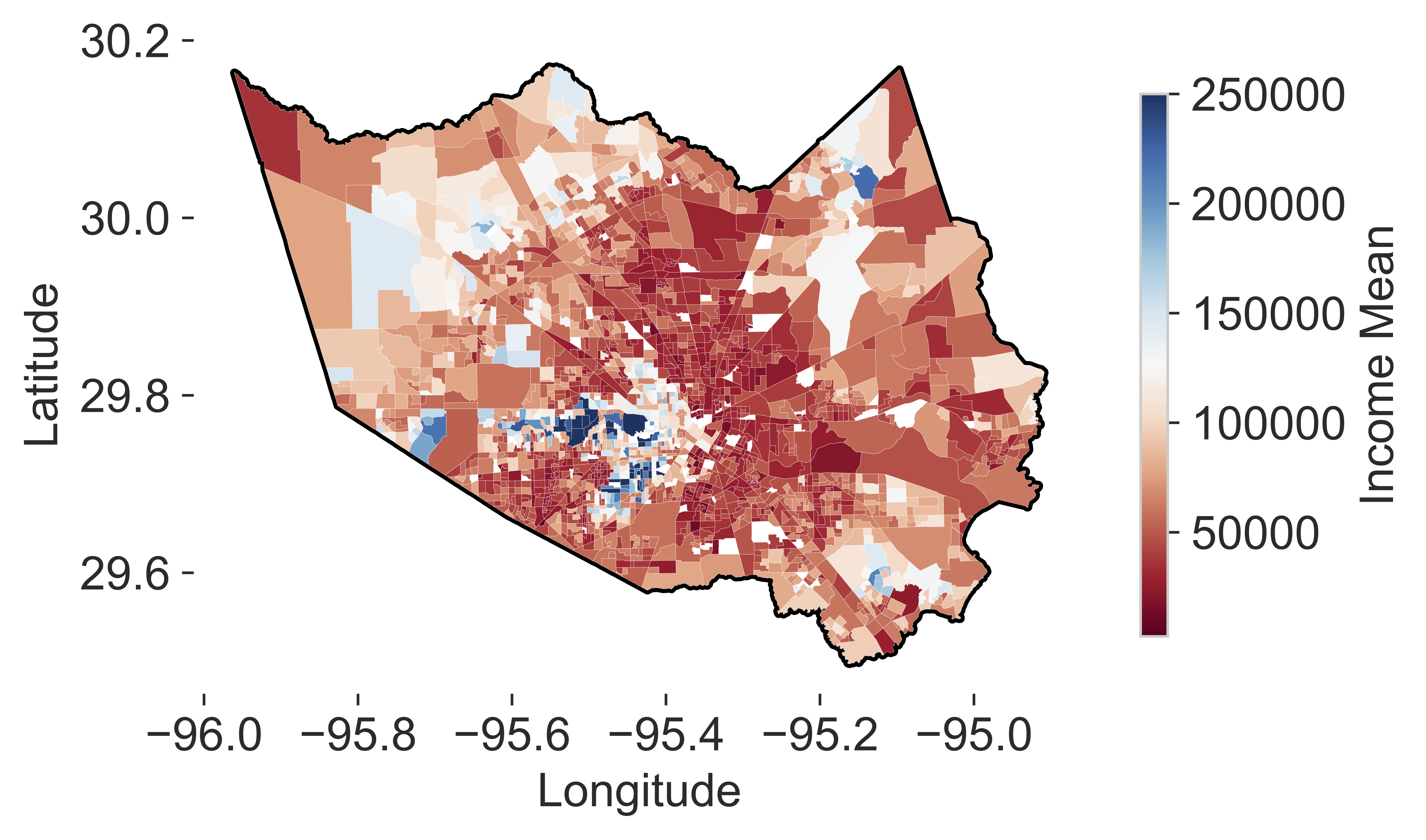 This graph uses CBGs (Census Block Group) as a unit to show the differences of Income in various regions.
Code
4. Professional expression of line-bar, scatterplot, and histogram
The following four images show the line-bar, scatterplot, and histogram used in professional journals, respectively.
Line bar
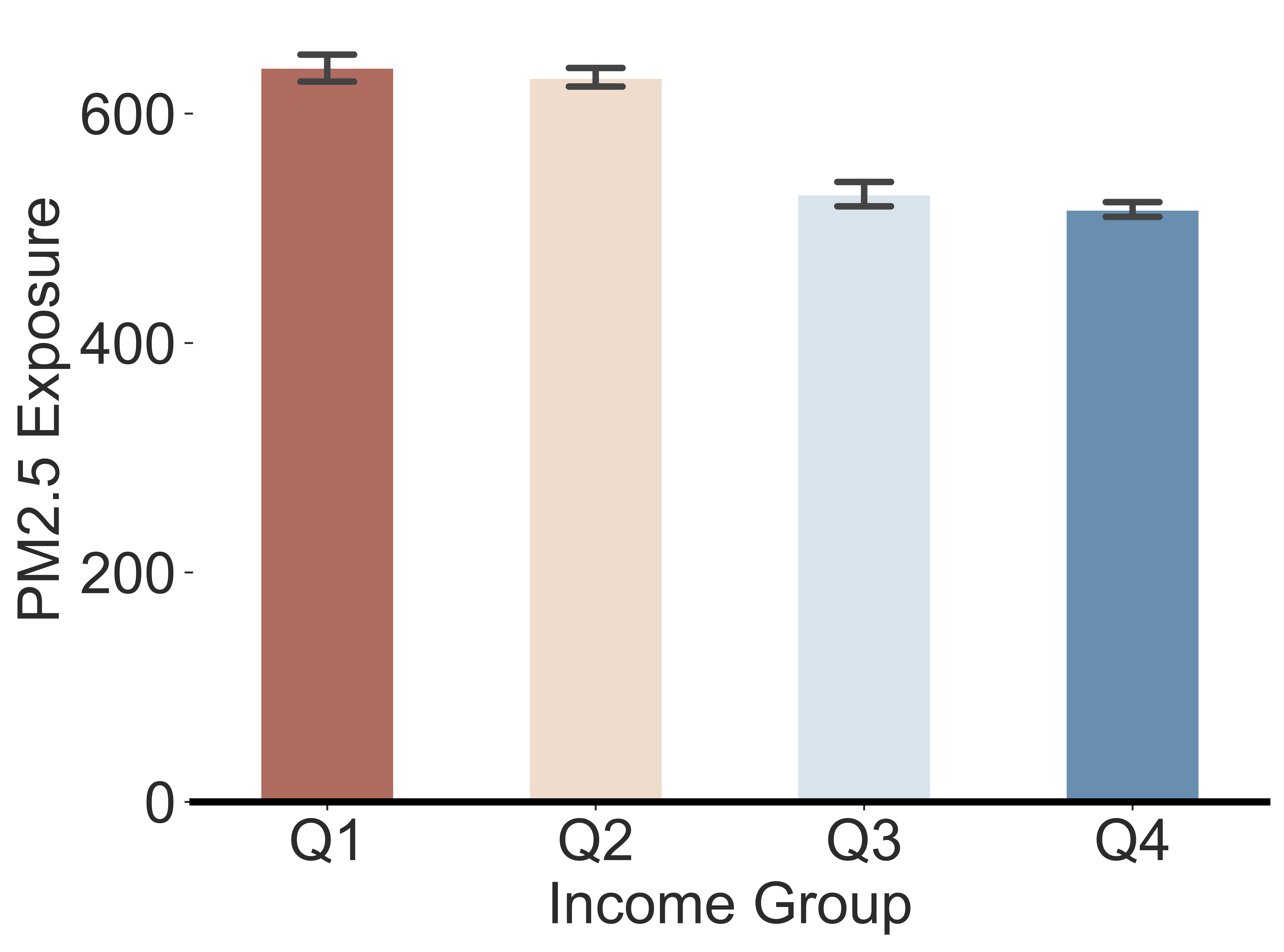 This figure shows the income presentation of the four income groups, and adds the error bar to indicate the 95% confidence interval in the gap between groups. If the error bar overlaps between the two groups, it means that the difference between the two groups is not significant.
Code
Scatterplot
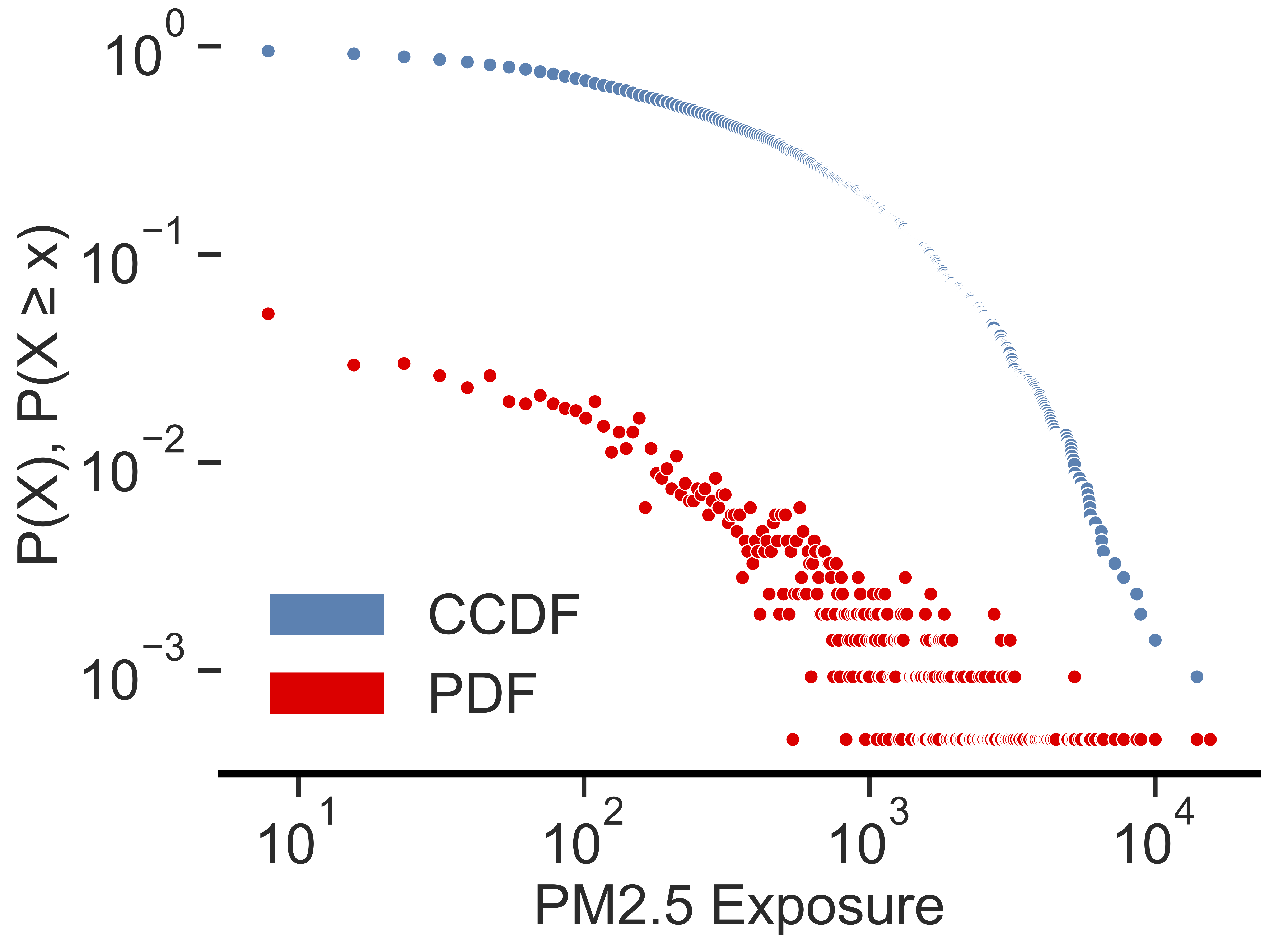 Scatter plots can be used to show the relationship between probability densities and variable series. At the same time, this figure also compares the probability density of two different variables.
Code
Histogram
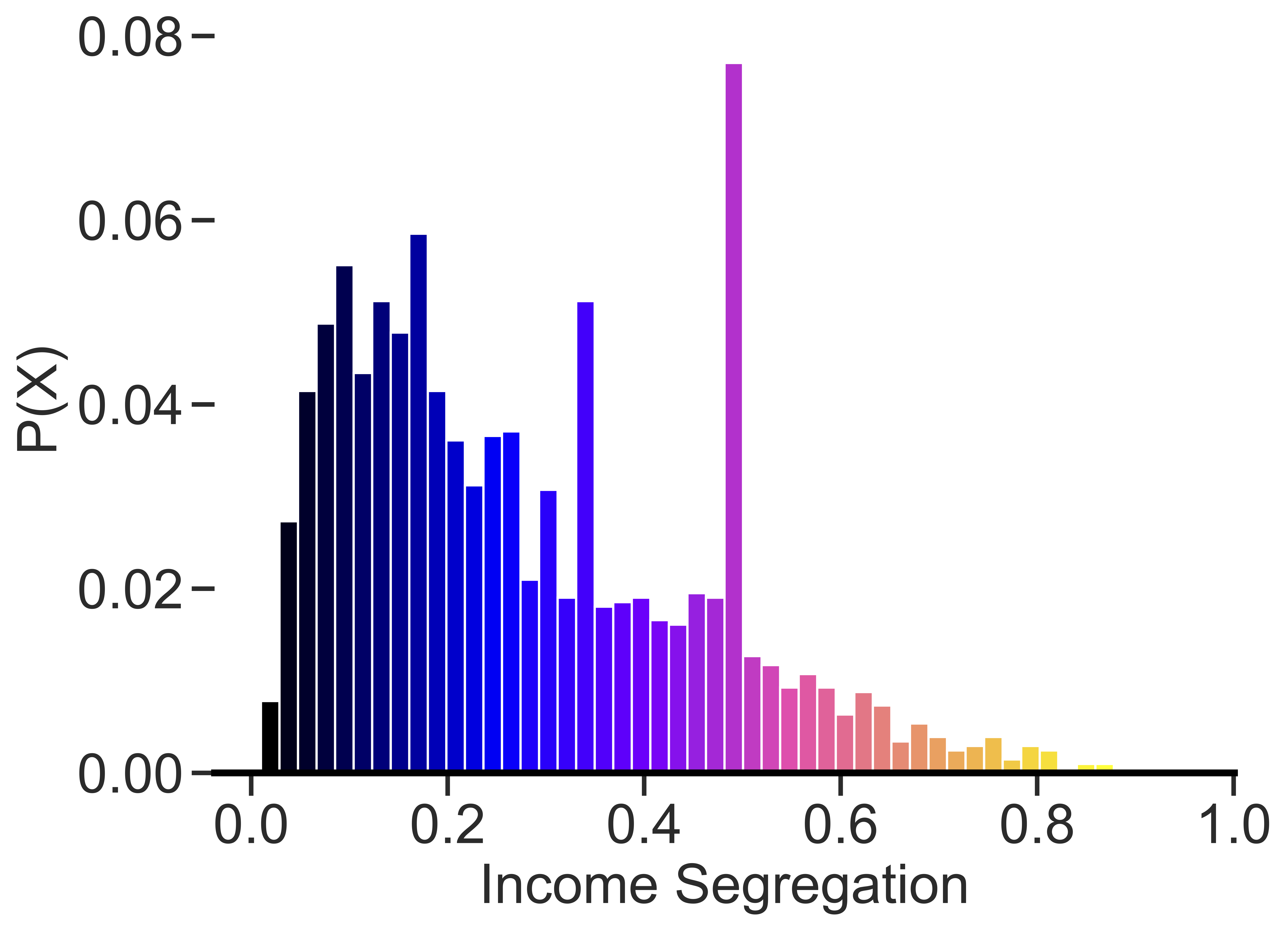 This figure demonstrates the flexibility to control the difference between bin and n. In addition, the visibility of the data can be better reflected through the transformation of color.
Code
5. Advanced Line bar chart
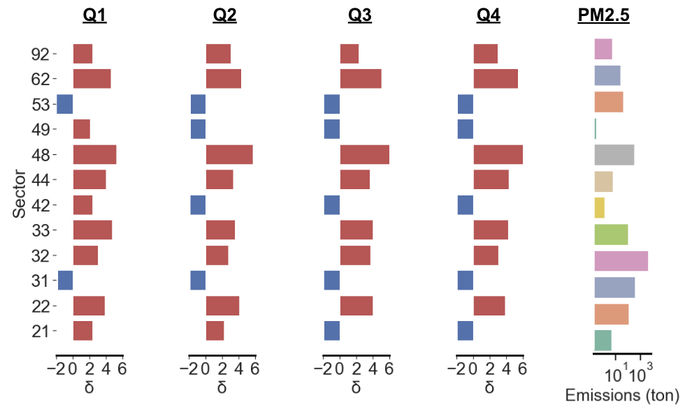 This graph shows the relationship between different emitting industries and human activities. Through advanced drawing techniques, we distinguish the positive and negative values of the data with different colors, and also classify the total emissions of various industries with colors.
Code